Open Gate was an absolute game-changer for me when I discovered it through a post on Reddit. It allowed me to integrate parts of my workflow that were otherwise disconnected, jumping between my browser and Obsidian.
Open Gate allows you to embed websites into Obsidian either as a full tab in the main tab group, as a tab on the sidebars, or as an embed into a note. Another awesome thing it lets you do is apply custom styling to those sites, allowing you to hide/reposition elements or restyle the page to do something like dark mode for sites that don't support it out of the box.
Use Case: ChatGPT
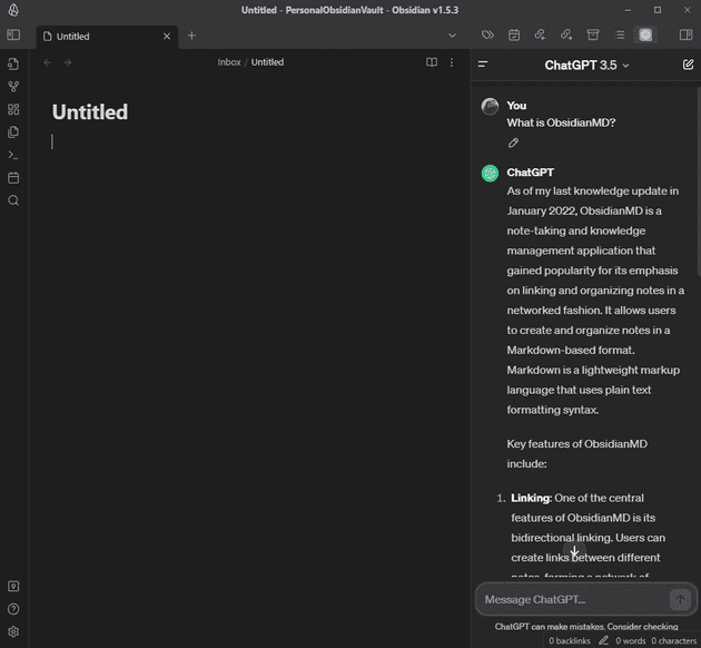
There are many plugins that use ChatGPT for Obsidian, but most of them require you to purchase API credits from OpenAI. If you need your bot to be aware of your notes to be able to ask it questions about them, these are probably your best bet. However, if you simply want the web version of ChatGPT easily accessible to you in Obsidian, Open Gate can help.
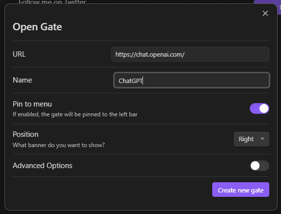
First, we create a new Gate by going to the plugin settings and clicking "New gate". In this modal, we provide the name, the URL, and the position.
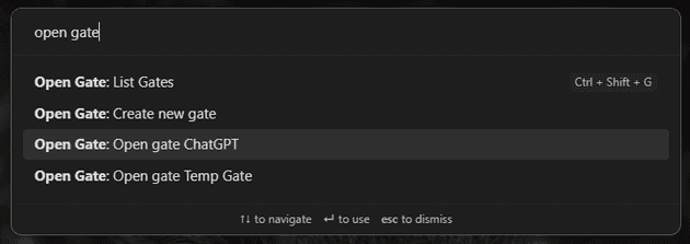
Next, you can use the quick switcher to run Open Gate: Open gate ChatGPT.
This will open it in the sidebar. Once you log in to ChatGPT, you'll now have ChatGPT in your sidebar!
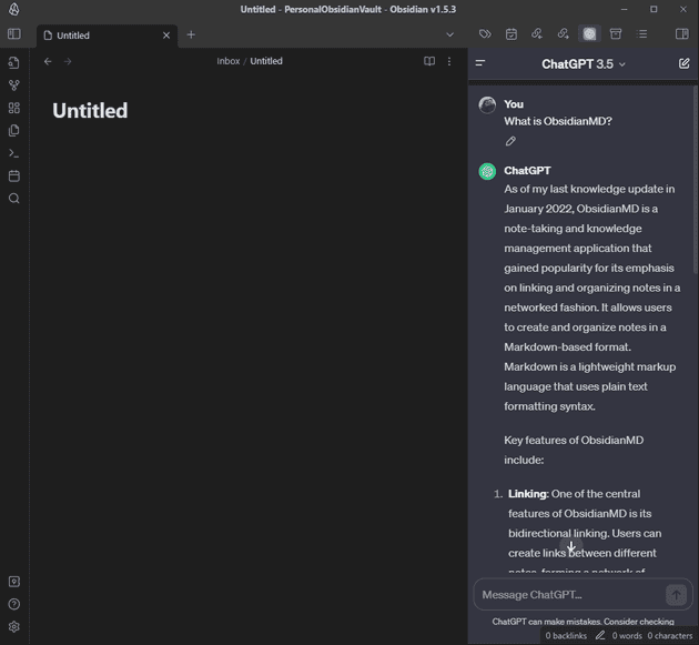
However, it doesn't quite fit in with our theme. We can go back to the plugin settings, edit that gate, enable "Advanced Options," and provide some CSS.
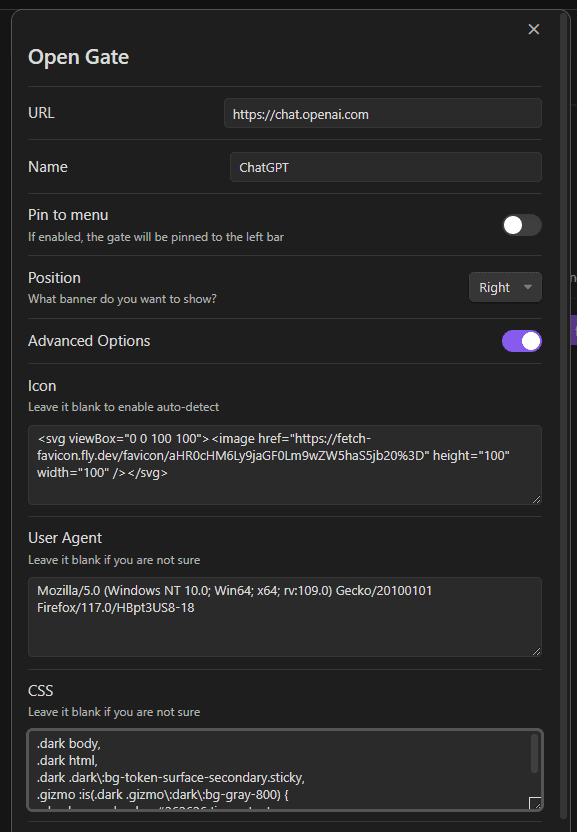
.dark body,
.dark html,
.dark .dark\:bg-token-surface-secondary.sticky,
.gizmo :is(.dark .gizmo\:dark\:bg-gray-800) {
  background-color: #262626 !important;
}

main .absolute.left-0.right-0,
main .sticky.top-0 {
  display: none !important;
}
Once we click "Save gate" and reload Obsidian, the ChatGPT gate will now be styled based on our CSS.

Use Case: Documentation
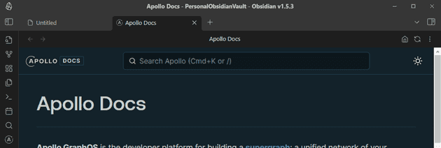
I very frequently open the documentation for the company I work at, Apollo GraphQL. It is super convenient to have this documentation handy right within Obsidian.
We again create a new gate in settings, but this time we set the position to Center and toggle on Pin to Menu. This results
in a new icon being added to the left Ribbon.
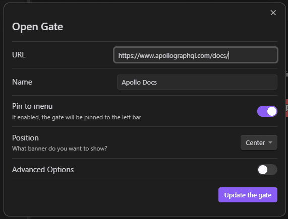
I now have an icon on the left, and when I click it, the docs open in a new tab!
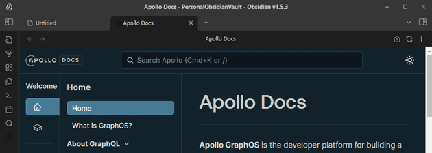
One issue, however, is that the icon is incredibly difficult to see because of black on dark grey. By default, Open Gate uses a service to fetch the favicon and uses it as a SVG. However, you can override this in the gate settings.
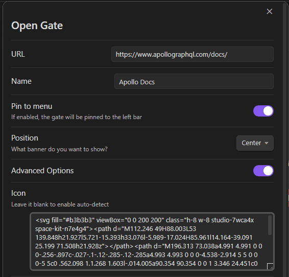
And now we have an icon that feels much more at home!

Use Case: Dashboard Note
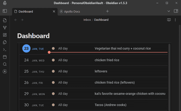
Let's imagine I am creating a personal "dashboard" for myself, and I want to include information from inside and outside of Obsidian. I can use embedded gates, with styling, to pull information directly into an Obsidian note.
For example, I have a meal plan that I use Google Calendar for. Say I wanted to pull this calendar into a note in Obsidian.
To do this, we use a code block with gate as the language and put the URL that we want to open. We should also provide
a height.
```gate
https://calendar.google.com/calendar/u/0/r/agenda
height: 800
```
While I've got Google Calendar in my notes now, it's light mode and has a lot of UI taking up valuable space.
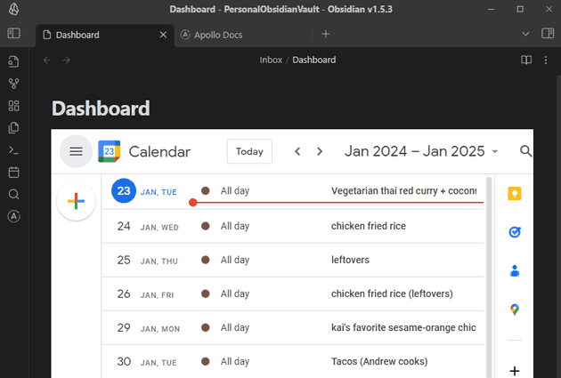
We can use custom CSS in our code block to switch it to dark mode and remove some elements by providing the css property
in our inline gate.
```gate
https://calendar.google.com/calendar/u/0/r/agenda
height: 800
css: |
	html {
	    -webkit-filter: invert(90%) hue-rotate(180deg)!important;
	    filter: invert(90%) hue-rotate(180deg)!important;
	    background: rgb(25, 25, 25)!important;
    }

	img, svg {
		filter: invert(100%) hue-rotate(180deg) brightness(1.1) contrast(105%)!important;
	}

	header { display: none !important; }
	[aria-label="Side panel"] { display: none !important; }
	[data-is-drawer-closed] { display: none !important; }
	[data-is-drawer-closed] + div > div:first-child { display: none !important; }
```
Now I've got a block that is just what I need and fits pretty well into my note.

Conclusion
The limit is really your imagination with this plugin. I find new uses for it all the time.
Interested in using this plugin? Install it and give it a try! Know of another plugin we should cover? Let us know in the comments below!


